The Buddi App
A peer-to-peer chat app that helps college students with mental health.


Project Overview
During the COVID-19 pandemic, college students needed a better way to access campus mental health resources services. In response, east coast-based start-up Buddi created a mobile app to give students access to campus peer-to-peer programs. Students could could now chat or vent with with a trained student “listener”. A beta version of the app was released to 136 U.S. universities with positive reviews. For its next release, Buddi sought UX expertise to review and improve the UX and UI for their mobile iOS app.
Together with two other UX Design Interns, I completed this project in 4 weeks.
Pen and paper
Figma
Figjam
Userberry
Google Slides
Trello
Tools
Proto-Persona
Heuristic evaluation
Information Architecture
Workshop Facilitation
Ideate and prototype
UI Design
My Role: UX Design Intern
The design is still in implementation stage, but here are the internal impacts of our team’s efforts:
Productivity and quality. Sped up development work by using a modular design approach to make future design scalable .
Impact on design practice. We introduced tools, methodologies, and workshops to help build up user-centered practices and processes.
Outcomes
Design Goals
Together with two other UX Designer interns, I was brought in to help Buddi prepare for its next release. Buddi had a few objectives:
Create a coherent visual design matching iOs standards.
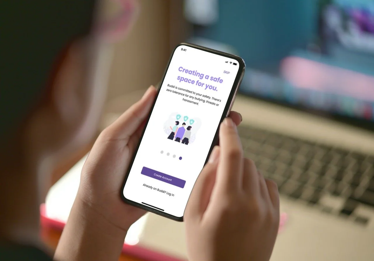
Improve the onboarding experience so that college students could quickly access tools.
The Design Process
All three designers and our stakeholders worked in different time zones. To help us stay on track, we used a Kanban board and developed a sprint schedule and set up weekly meetings to help us us track our progress and to identify when to tap into user feedback or input in the design process.
Constraints and Ambiguities
In this project, our team discovered that the most current design of the Buddi app was on Apple’s TestFlight (no recent design file). We also found out Buddi planned to remove existing features in favor of others to deliver more value—potentially affecting the information space. To help us prioritize our work for a minimum viable product and help Buddi plan the future, we completed a few UX and product strategy activities.
Scoping Activities
Desk research to understand the industry
“As is” wireflows
“As is” Sitemap
Problems & Opportunities Exercise
Effort/Impact Matrix (see image)
UX Roadmap
Outcomes
Features backlog
Define our team’s scope of work
Updated and feasible sprint plan
Diving Into the User Profile
To understand who we are designing for, I lead a co-creation workshop with Buddi’s stakeholders. We helped them discuss, document, and align on user needs related to their primary user group: university students. The Buddi team was able to discover how proto-personas can be a visual tool to reference when strategizing and designing out features for real people.
Interesting user insights included:
University students want to know someone out there cares. They seek authenticity and someone to validate their thinking (“I’m not crazy!”).
University students need accessible tools during various times of the day for individualized help.
Solutions should encourage the user in a non-judgmental but affirming tone so they can fully express one’s self.
Hannah, the University Student (click to view)
The Baseline Design
To complete our analysis of the baseline design, each UX designer conducted a heuristic evaluation of the current UI. We referenced on Jakob Nielsen’s established model for this activity. We compared findings and agreed to focus usability issues where we had the highest level of agreement.
Top usability issues on the beta screens:
#3 - User Control and Freedom. Users need to know they can exit or leave when navigating the app.
#8 - Aesthetic and Minimalist Design (example of mark up below). Information should be relevant and not distracting when completing tasks.
How Users Organize Mental Health Concepts
When we earlier learned that main features would be removed in favor of new ones, we knew it would affect the information space for this MVP. It was time to bring users into the design process and get their feedback so we can validate the app’s information architecture. We ran an open card sort in 5 days and recruited 15 enrolled or recently graduated college students to organize 40 cards and label groupings.
Results
We experienced many drop-outs during the activity and noticed some limits with our online tool Useberry. We kept recruiting by tapping into Buddi’s network of college contacts. Eventually, we met our goal of 15 participants (see study on rationale for participant number). Once the study closed, we conducted affinity mapping to review participant beliefs and groupings.
Takeaways
We learned that in mental health apps, for the most part people sorted features into two groups: resources and tools.
Resources. These include emergency numbers or more reference-based information.
Tools. Certain mental health activities need to be more accessible because it can be done “during alone time” or “to clear one’s mind” or for “self-care”. Participants grouped many of these features together even though they did not hold an overall agreement on a category name.
Outcomes
Recommended words and labels
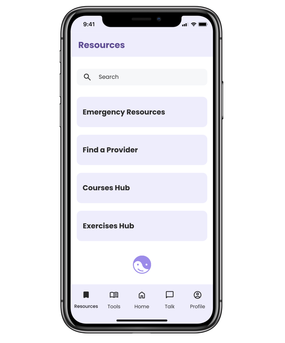
New addition to the navigation bar: Tools
Revised Sitemap (see below).
Optimizing User Flows
Next, each designer worked on their assigned flows. I was responsible for the onboarding and account creation process. My aim was to shorten onboarding in a way that still delivers information but avoids cognitive overload. We all decided to focus on the direct “happy path” but included some alternative paths as well. In the next steps, these should be tested with real users.
Rapid Prototyping
With flows in hand, it was time for each designer to explore solutions. Rapid prototyping allowed us to go through various concepts and layouts fast.

Our Iterative Process
We continued to iterate on several versions of our flows, eventually taking our designs to higher fidelity in time for stakeholder feedback. The following activities helped us deliver on time:
Our Lead led a UI workshop with the Buddi product owner/CEO to help determine a design direction
We reviewed the Apple Human Interface Guidelines and WCAG guidelines
We held a internal UX design crit to check our work
Visual Design Principles
Here are examples of how I reduced clutter on the screens and improved the visual hierarchy through appropriate use of spacing, colors, typography, and other elements. Content needed to be revealed at the right time and given more room to breathe so that users can focus on the task at hand.
We adhered to the branding colors which were softer and calming but we also used proper contrasting colors (WCAG accessibility guidelines) as needed for CTAs. The following screens show comparisons between dark mode (our only access) and my concepts.
Final Designs
In the end, our iterative process helped us deliver the project in time with a starting UI library. If we had more time, I would have probably considered working with the animation team to add more interactive moments in the app.
Screens for the Buddi App
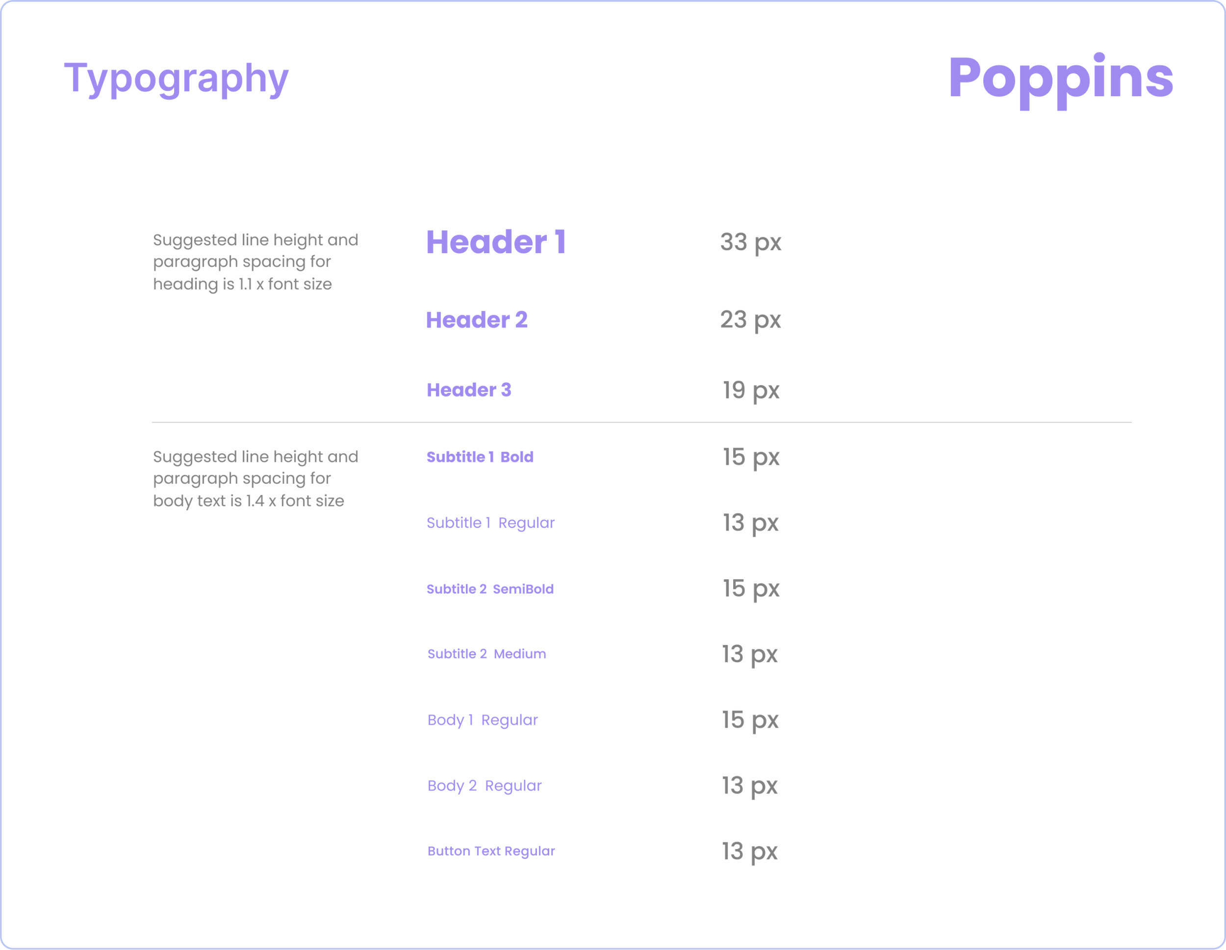
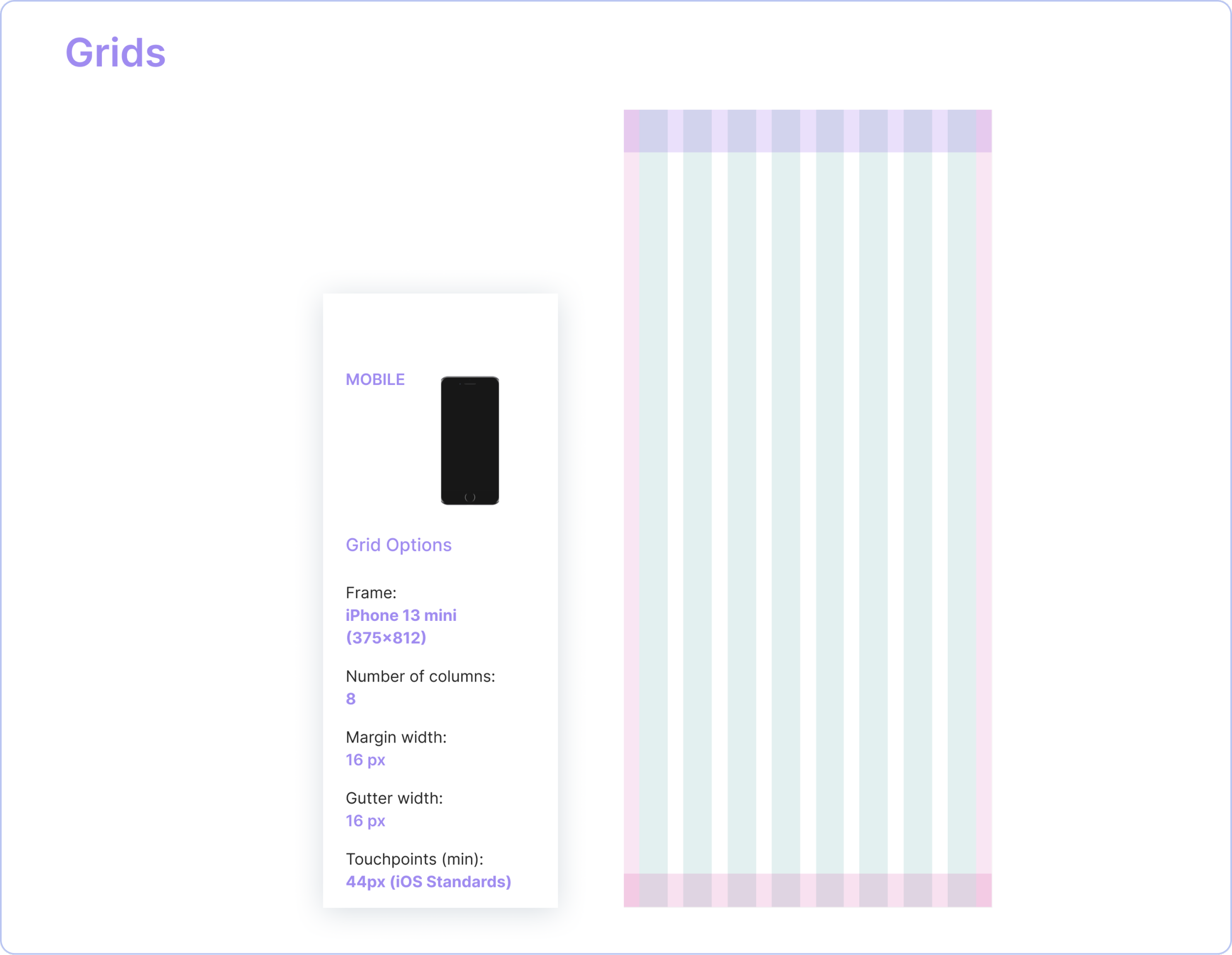
UI Style Guide
Our Lead set up and finalized the style guide and we were able to asynchronously update UI components for this project. The following is an excerpt.

Key Learnings
In mental health apps, people engage more when the app helps them use features in crisis or healing moments. Good design and thought out flows improve findability and can lead to more tool usage and engagement.
Technology use and times change—so we must continue to get feedback from our users. Social media and artificial intelligence can impact psychology and mental health. As users evolve to meet a seemingly more complexity society, so should mental health apps. Continuous learning is key to continue solving for users.
Modular design helps with design implementation and communication. Unfortunately, we did not get to meet the app’s developer in this phase. But once we could tap into the library of Material 3’s components, we were able to customize some of these reusable components to give it an iOS feel for smoother implementation. Additionally, using this dependable language system created stronger designer workflows that allowed us to communicate and deliver fast.


