Property Trove
A real estate app that helps unseasoned buyers find small-scale investment property.

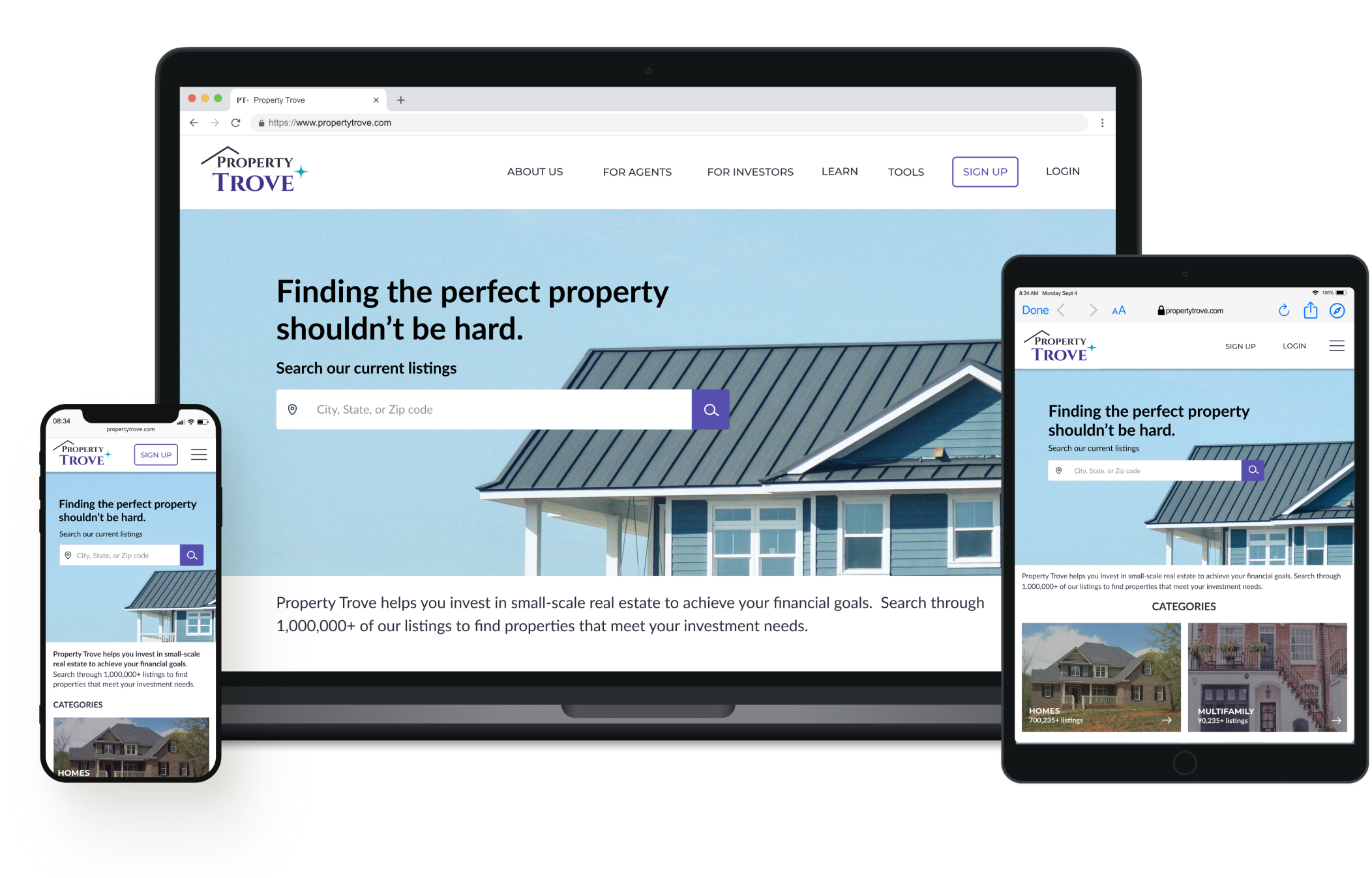

Project Overview
This project is part of a UI specialization course I finished in 2021. In this visual design project, I designed digital interactions for a specific set of users who will use a responsive web application. In an industry where photos influence, screens must have optimized layouts and intentionally chosen UI elements to lessen visual clutter. I got the opportunity to create a logo, design icons and apply a visual brand language.
This project was completed in 11 weeks.
TOOLS
Pen and paper (for solution sketches)
Figma (digital wireframing and prototyping)
PowerPoint (for deck presentations)
MY ROLE: UI Designer
Ideate solutions
Prototype screens
Create a visual brand language
Incorporate feedback from mentor UI Principal Designer
OUTCOMES
Deliverables included a prototype of the app and a style guide.
There are real-world no metrics right now because this is a concept project. But if an MVP version was deployed in the real world, I would perform user testing to analyze usability, customer engagement and other performance metrics. Then I would prioritize iterations based on a severity rating such as critical errors.
The Problem
Real estate is a popular way to invest in one’s future. Unseasoned buyers need a way to receive reliable, uncomplicated information about investment properties because they want to purchase small-scale property for financial security.
We know this to be true when we see them taking time from their busy lives to quickly search and assess listings throughout the day.

The Goal
The objective of this project was to design a responsive web app to help on-the-go buyers get relevant information and receive guidance on properties of interest.
My Design Process
Desk Research

Note: For this UI concept project, we were to assume all UX research activities, persona work, and user stories were done in a previous design phase.
On my own, I quickly completed some light research to help me understand real estate and investor terms and concepts. I learned that industry research helps you understand the market and think about differentiation.
Secondary research revealed that photographs are important to surveyed buyers. Knowing this, I needed to use UI elements to support—rather than compete against—these focal points.
Project Requirements
Features and user stories were already part of the UI project brief. I relied on user stories to help see core features from the target user’s perspective. User stories helped me make design decisions that factor in a user’s real needs and motivations.
User Flows
Before any screens can be prototyped, it’s important to understand how our users can complete their goals in our app. To see all paths, I completed a task analysis and mapped out core user flows.
Ideation
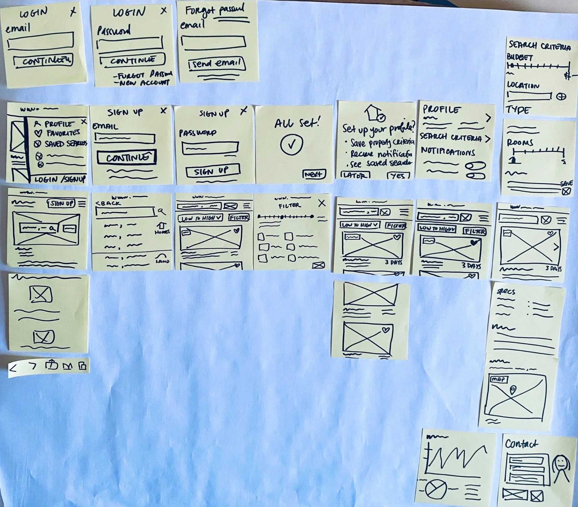
With flows in hand, my next goal was to get design ideas out quickly.
To do this, my workflow included a rapid prototyping activity using pen and paper and post-its.
These early sketches helped me explore layout ideas, key screens, navigation, app functionalities and potential UI copy.
Prototyping
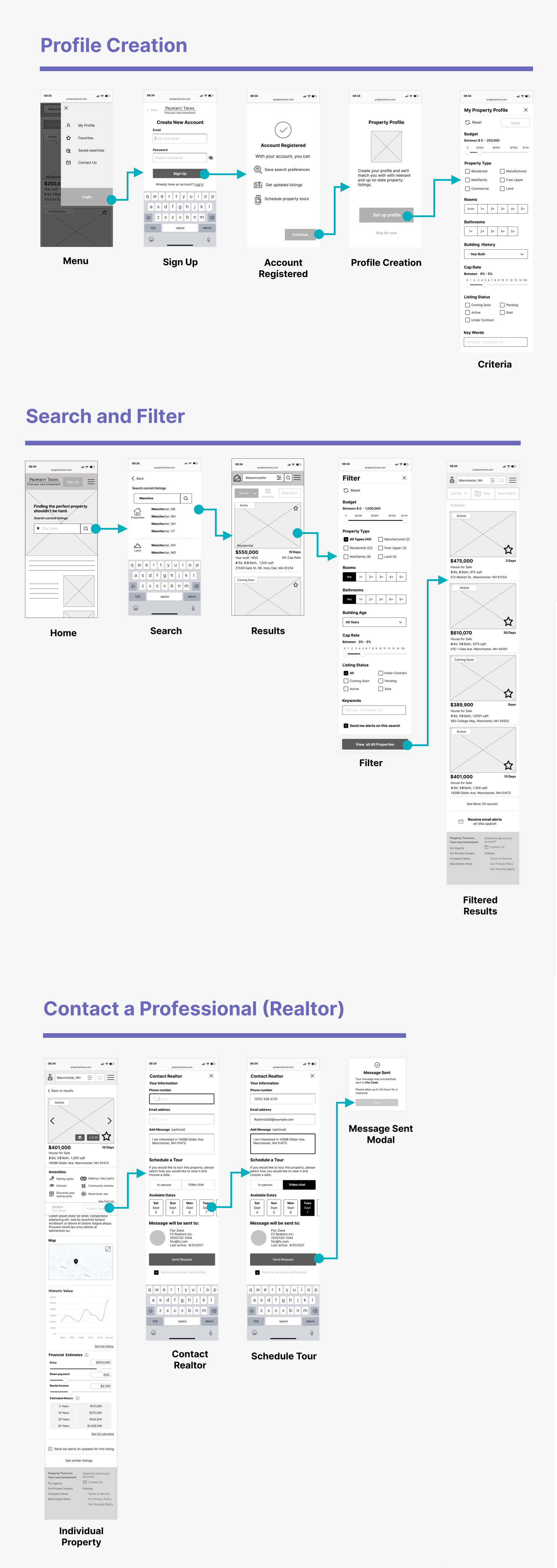
After a few iterations, I created digital wireframes and began prototyping the app in Figma using design principles such as:
Layout and Grids
Content Hierarchy
Spacing
Size
Next, I began adding UI patterns and interactions to aid in task completion including:
Predictive search in text fields
Button states for visual feedback
Icons to help the user understand information faster
Modals for action confirmation
Other UI controls for data inputs including checkboxes and sliding scales so the user can easily use touch to filter properties
If I had more time, I would evaluate these mid-fidelity wireframe flows with real users to test for interaction.
Visual Brand Language
To develop a visual direction for this app, I came up with at least two mood boards and selected the theme which best aligned with the project brief. I researched themes, fonts, colors, photos and other UI elements.
The final style guide is inspired by the mood board. It was created as part of design documentation and to capture the app’s brand identity.
Review the full style guide or view elements of the design from below.
Design Feedback
After receiving some feedback from my UI mentor, I updated the following:
I changed my icon type to outlines (rather than filled in) to balance the visual weight.
I made adjustments to the composition of certain screens once property photos were added.
I checked colors against accessibility guidelines under WCAG.
I also added a sticky navigation bar to help users contact a realtor quickly. This is a priority feature so I did not want users scrolling to find it. But I kept the colors minimal to avoid visual overload.
Final Designs
As more layers of design were added to the prototype, I finalized illustrations, imagery and animation placement.
Additionally, I adapted the design for responsive breakpoints. I prepared some wireframes for tablet and desktop breakpoints.
Finally, I prepared some mockups as part of my handoff for this project.
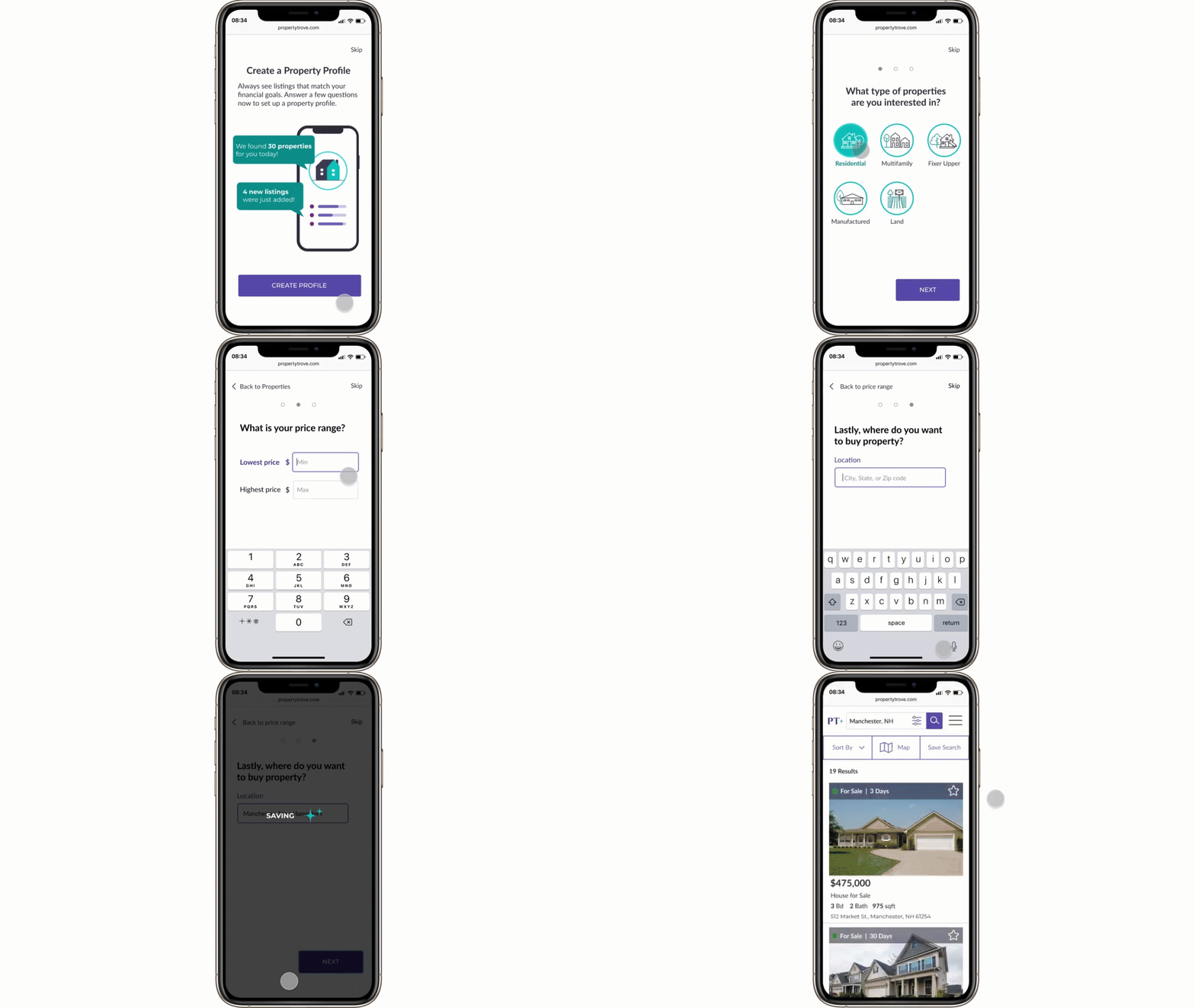
Profile Creation
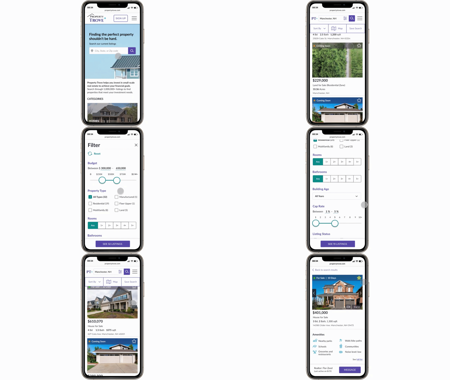
Search and Filter
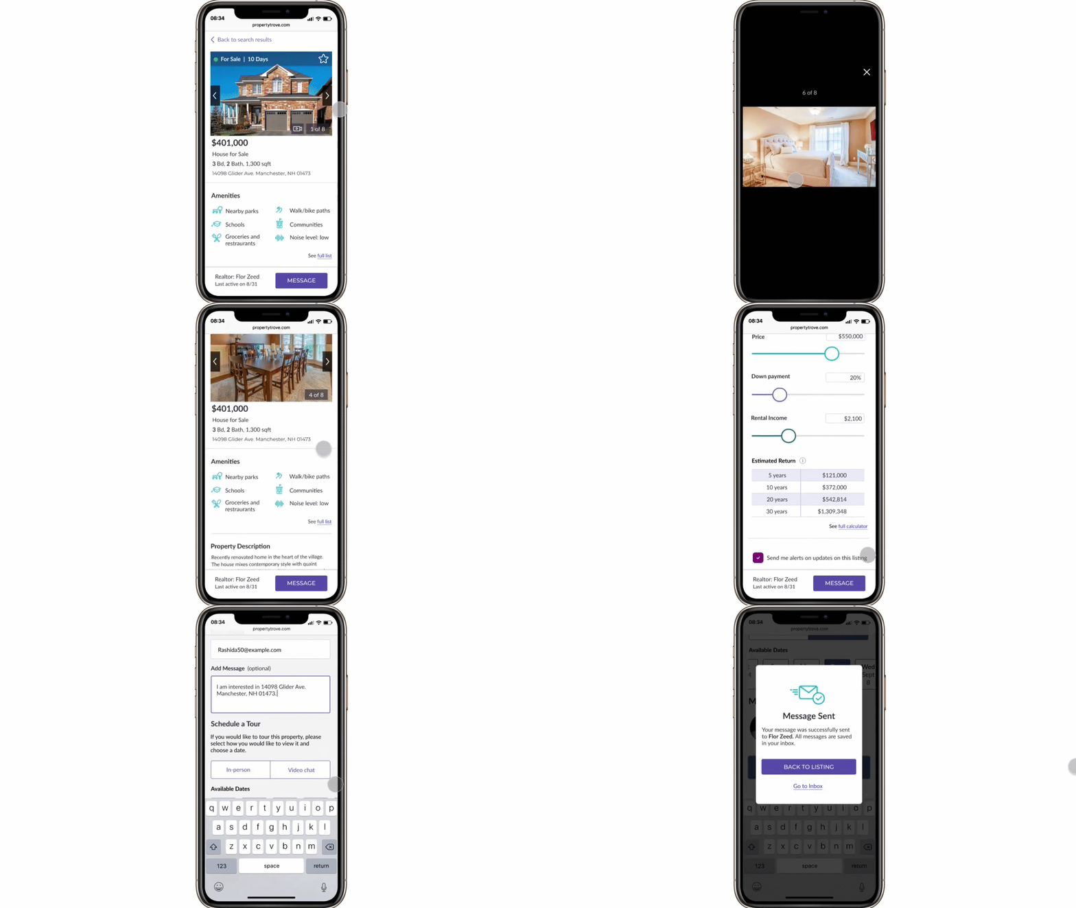
Contact Realtor
Final Thoughts
User Testing. If I had more time, I would put the prototype in the hands of users as early as possible to test my flows for task completion and any other feedback. I would also use preference testing to evaluate the illustrations used to onboard and create a profile in the app.
Branding. Creating a visual brand language is very important for real estate apps to help with reputation and differentiation.
